In the bustling world of print media, where every square inch counts, the battle for the reader's attention is fierce. Today, we're embarking on a fascinating journey through the realm of newspaper advertising, examining the fine line between informative and overwhelming. Join me as we dissect the text density, clutter, and overall impact of five distinct newspaper ads, unraveling the secrets behind effective print advertisement design.
"Setting the Scene: The Importance of Ad Analysis"
Before diving into the specifics, let's understand why this examination
matters. Advertisement scrutiny, particularly in newspapers, plays a pivotal
role in determining an ad's success. Analyzing impact of ads, including text
density scrutiny and clutter impact assessment, provides invaluable insights
into how advertisements can be optimized for maximum engagement and
effectiveness. This process not only enhances the reader's experience but also
bolsters the ad's persuasive power.
"Apollo Progressive Convent School: An Examination of Educational
Promise"
First on our list is the Apollo Progressive Convent School's ad. At
first glance, the ad's text density and colorful presentation aim to capture
the reader's attention with promises of scholarships and a bright future.
However, a closer text density analysis reveals a potential for visual clutter
due to the combination of multiple fonts, colors, and detailed information.
This clutter assessment suggests that while the ad is rich in information, its
effectiveness might be diluted by its busy appearance.
"The Balance Between Information and Aesthetics"
Despite the potential for visual overload, the Apollo ad's content
density assessment underscores the challenge many educational institutions
face: conveying extensive opportunities without overwhelming prospects. The
ad's cluttered layout might impact its clarity, yet it also reflects the
school's eagerness to showcase its offerings. This juxtaposition invites a
discussion on the need for balance in print media evaluation, highlighting the
importance of design in ad content examination.
"SRI Ramchandra Institute: A Palette of Professional Promise"
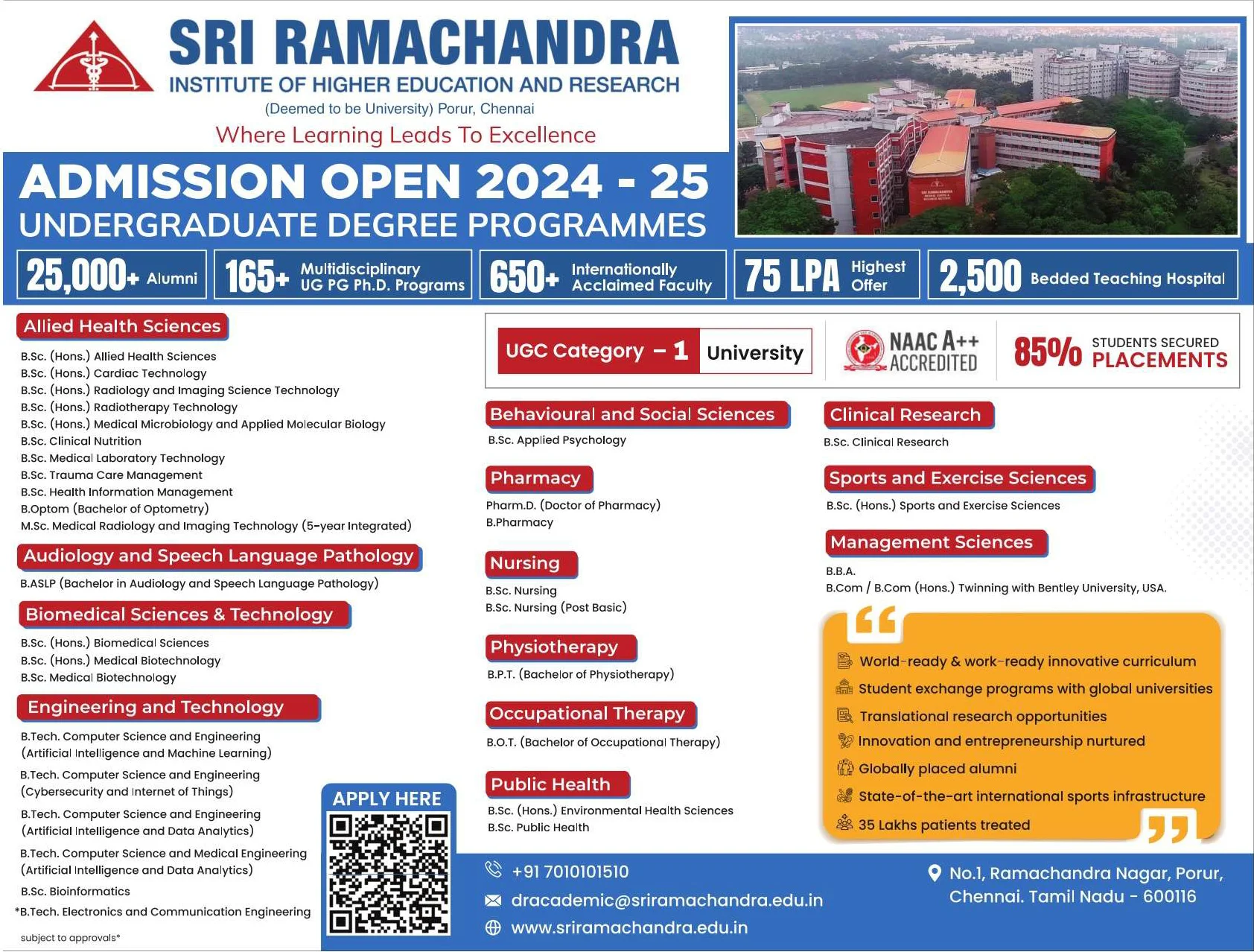
Transitioning to the SRI Ramchandra Institute's advertisement, we
encounter a different approach. This ad utilizes a strategic blend of colors
and concise text to highlight its educational prowess. The ad content scrutiny
here focuses on the institute's achievements and offerings, presented with a
clarity that aims to cut through the noise. Yet, the use of multiple colors and
a QR code suggests an attempt to balance informative content with visual
appeal.
 |
| Image Credit: Sri Ramachandra Medical College |
"Navigating the Crossroads of Clarity and Engagement"
The institute's ad exemplifies a print advertisement examination where
clarity and visual appeal intersect. The visual clutter analysis here might
suggest a high degree of visual stimuli, but the structured layout prevents the
ad from feeling overwhelming. This approach underscores the evolving strategies
in newspaper advertising assessment, where clarity and engagement are not
mutually exclusive but rather complementary.
"Banasthali Vidyapeeth: Crafting a Vision for Women's Education"
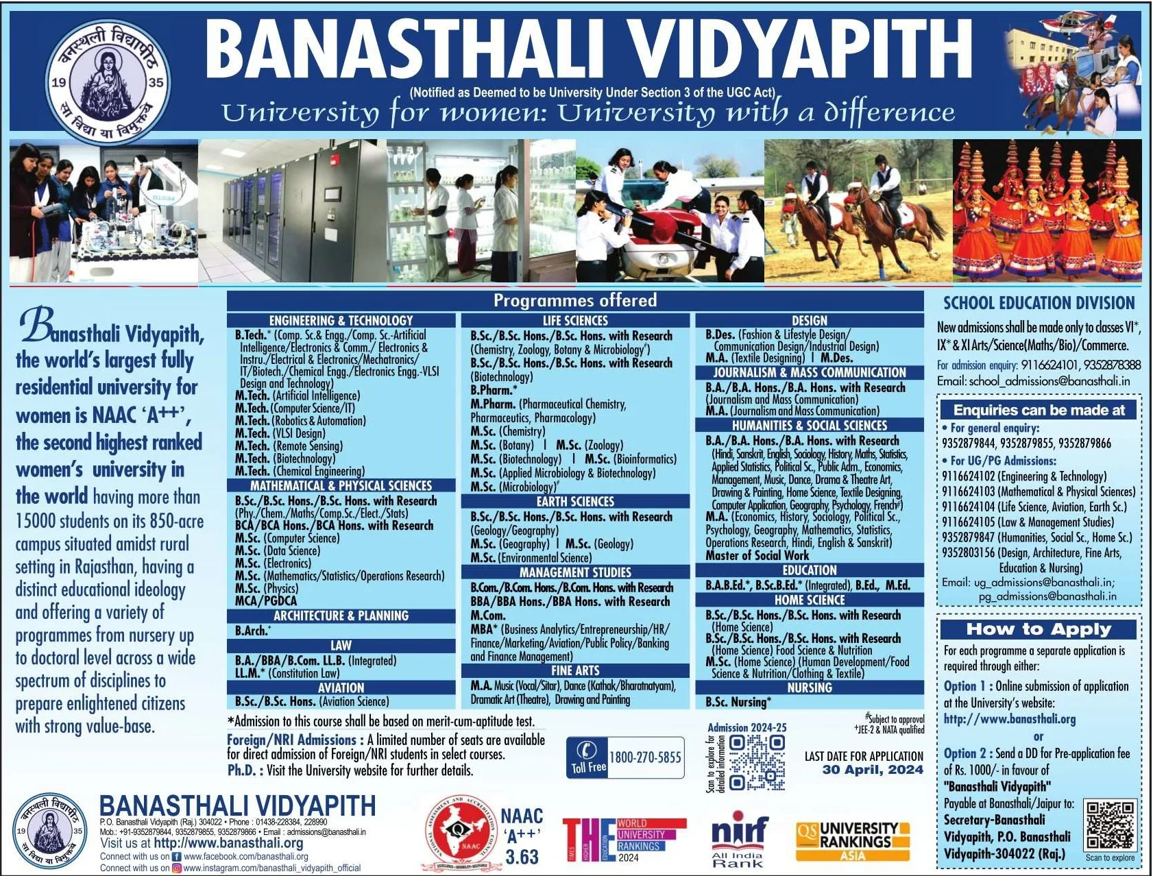
The Banasthali Vidyapeeth advertisement stands out for its ambitious
portrayal of women's education. The ad's textual density examination reveals a
dense narrative packed with achievements and offerings. Despite the potential
risk of ad clutter evaluation pointing towards a crowded design, the ad's
narrative strength carries the potential to resonate deeply with its target
audience, emphasizing the power of content-driven design.
 |
| Image Credit: Banasthali Vidyapith |
"The Art of Storytelling in Ad Design"
This ad's impact analysis of print ads shows how storytelling can be a
potent tool in engaging readers. The clutter assessment, while noting the dense
layout, also appreciates the ad's ability to convey a compelling narrative.
This highlights an essential aspect of print media clutter analysis: the
ability of a strong story to transcend design limitations, engaging readers on
a more profound level.
"Pragya Sr. Sec School: A Comprehensive Educational Offer"
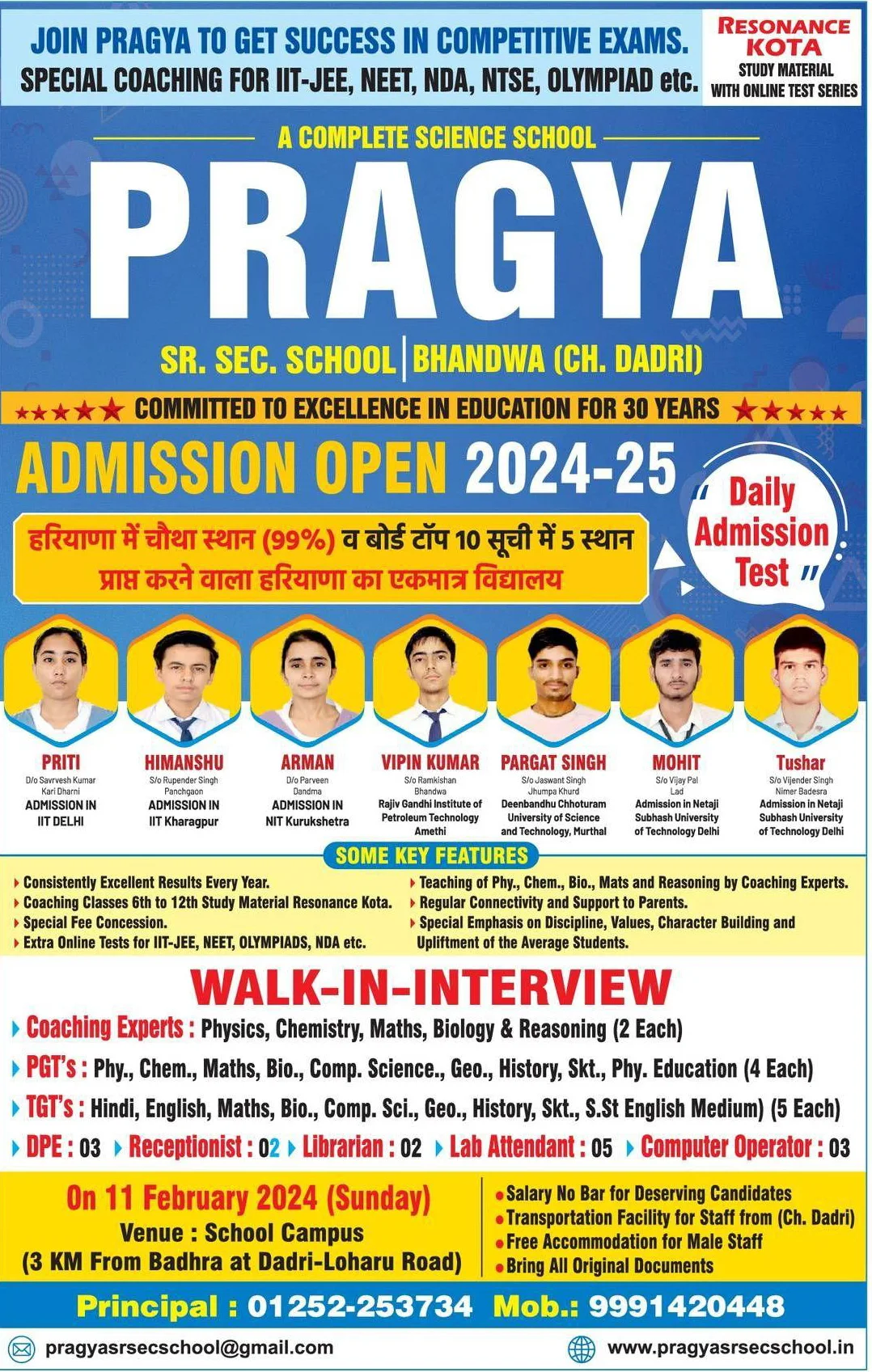
The Pragya Sr. Sec School ad takes a comprehensive approach, combining
educational promises with success stories. The ad text analysis here delves
into how the combination of information, testimonials, and calls to action
contribute to an ad's effectiveness. While the ad content scrutiny recognizes a
high text density, it also acknowledges the strategic use of success stories to
inspire potential students.
 |
| Image Credit: Pragya Sr. Sec School |
"Leveraging Success Stories for Greater Impact"
The examination of this ad underscores the effectiveness of
incorporating success stories into the advertisement text density review. These
narratives serve not only to inform but also to inspire, adding a layer of
engagement that pure information cannot achieve. This strategy illustrates a
key finding in analyzing clutter in newspaper ads: when used judiciously,
detailed content can enhance an ad's appeal rather than detract from it.
"Prince Sainik School: Shaping Futures with Precision"
Lastly, the Prince Sainik School's advertisement showcases a focused
approach to military education. The visual and ad content examination here
reveals a deliberate emphasis on achievements and the rigorous preparation
offered. The clutter impact assessment for this ad might highlight a dense
layout, but the specificity of its target audience allows for a more targeted
message, demonstrating the nuanced considerations in print advertisement text
analysis.
 |
| Image Credit: Prince Sainik School |
"Targeted Messaging in Ad Design"
This ad's clarity assessment highlights the importance of understanding
the target audience in ad design. By focusing on the specific aspirations and
interests of its audience, the ad achieves clarity through relevance, proving
that precision in messaging can significantly enhance ad effectiveness
evaluation.
"Conclusion: The Delicate Dance of Design and Information"
Our journey through these five advertisements illuminates the delicate
balance between design and information in creating effective newspaper ads.
From text density and clutter to storytelling and targeted messaging, each ad
offers unique insights into the art and science of print advertising. As we
reflect on these examples, it's clear that successful advertisement design is
not about adhering to a one-size-fits-all formula but rather about
understanding and engaging with the intended audience in meaningful ways.
In the realm of newspaper ad examination, the lessons are clear: balance, clarity, and engagement are paramount. Whether through minimizing clutter, leveraging success stories, or employing targeted messaging, the goal remains the same—to craft ads that not only catch the eye but also resonate with the heart.


