Introduction: The Visual Journey of Educational Excellence
In
today's digital age, the visual identity of educational institutions
plays a crucial role in attracting prospective students and establishing
a strong brand presence. A well-designed advertisement can communicate
the institution's values, strengths, and unique offerings effectively. Let's
dive into the world of educational branding by exploring the graphic design
elements of five prominent Indian institutions: Jaypee Edusphere, KIIT, LK
Singhania Education Centre, Narayana Conquers, and Vellore Institute of
Technology (VIT).

Jaypee Edusphere: Bridging Tradition and Modernity
A Timeless Legacy
Jaypee
Edusphere's
advertisement captures attention with its sophisticated and modern design.
The use of a clean, minimalist layout emphasizes the institution's
commitment to quality education while maintaining a connection to its
historical roots. The color scheme of blue and white exudes professionalism and
trustworthiness, essential qualities for any educational brand.
 |
| Image Credit::Jaypee Edusphere |
Innovative Learning Environment
The
imagery used in Jaypee Edusphere's advertisement showcases students
engaged in advanced learning environments, equipped with state-of-the-art
technology. This visual representation of innovation aligns with the
institution's message of nurturing creativity and essential skills. The
inclusion of students using Brain Computer Interface Labs highlights the
cutting-edge facilities available, setting a high standard for prospective
students.
KIIT: A Gateway to a Promising Future
Vibrant and Inviting
KIIT's
advertisement stands
out with its vibrant and inviting color palette. The use of green
and white symbolizes growth and purity, aligning with the institution's vision
of fostering holistic development. The cheerful and approachable imagery of
students conveys a sense of community and belonging, which is appealing to
potential applicants.
 |
| Image Credit :KIIT: A Gateway to a Promising Future |
Comprehensive Program Offerings
The
design effectively communicates the wide range of academic programs available
at KIIT. The structured layout makes it easy to navigate through the
information, highlighting key features such as the no examination fee,
extensive placement opportunities, and the impressive number of
companies associated with campus placements. This clear and concise presentation
ensures that important details are not lost in the visual clutter.
LK Singhania Education Centre: Excellence in Every Detail
Elegant and Refined
LK
Singhania Education Centre's advertisement exudes elegance and refinement. The use of a
predominantly blue color scheme conveys trust and reliability, while the high-quality
imagery of the campus and facilities emphasizes the institution's
commitment to providing a top-tier educational experience. The visual harmony
in the design reflects the meticulous attention to detail that the institution
prides itself on.
 |
| Image Credit :LK Singhania Education Centre |
Showcasing Achievements
The
advertisement effectively showcases the institution's achievements, including
its high rankings and distinctive features such as the 250 acres of landscaped
campus and state-of-the-art facilities. The inclusion of alumni
success stories adds a personal touch, making the institution's impact
tangible and relatable to prospective students and their parents.
Narayana Conquers: Celebrating Academic Triumphs
Bold and Impactful
Narayana
Conquers' advertisement is bold and impactful, celebrating the academic achievements
of its students. The use of bright orange and blue creates a striking contrast
that grabs attention. The layout focuses on the impressive scores of the
students, reinforcing the institution's reputation for academic excellence.
 |
| Image Credit : Narayana |
Highlighting Success Stories
The
advertisement places a strong emphasis on student success stories,
featuring photographs of top scorers with their impressive marks. This visual
approach not only showcases the institution's academic rigor but also inspires
prospective students to aim high. The strategic use of testimonials and scores
builds credibility and trust in the institution's educational approach.
VIT: Embracing Change and Innovation
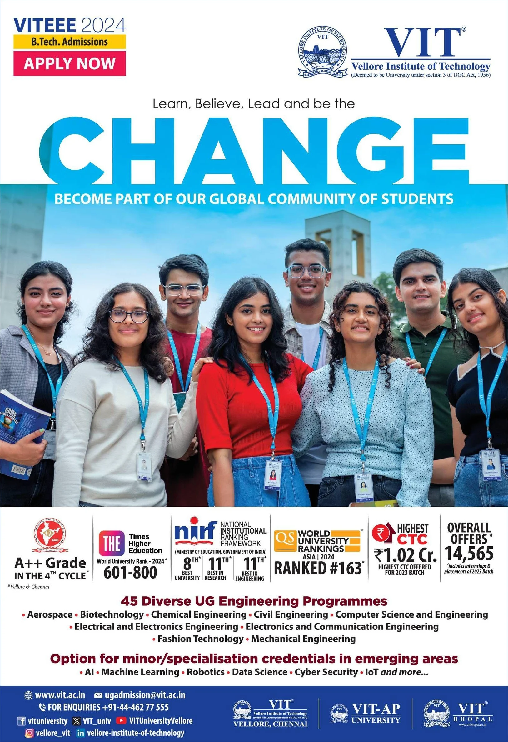
Dynamic and Forward-Thinking
Vellore
Institute of Technology (VIT) embraces a dynamic and forward-thinking
design in its advertisement. The use of bright and vibrant colors, along
with engaging student imagery, reflects the institution's energetic and
innovative spirit. The tagline "Learn, Believe, Lead and be the CHANGE"
is prominently displayed, reinforcing the institution's commitment to fostering
future leaders.
 |
| Image Credit : VIT |
Emphasis on Diversity and Inclusion
The
advertisement highlights VIT's diverse range of engineering programs and
specializations, catering to various interests and career aspirations. The
inclusive imagery of students from different backgrounds promotes a sense of
global community and belonging. This visual strategy effectively communicates
VIT's commitment to providing a holistic and inclusive educational environment.
Conclusion: Crafting a Visual Identity for Educational Excellence
In
conclusion, the graphic design of educational advertisements plays a pivotal
role in shaping the perception of institutions. Each of the five educational
institutions reviewed here—Jaypee Edusphere, KIIT, LK Singhania Education
Centre, Narayana Conquers, and VIT—has effectively utilized visual elements to
convey their unique strengths and values. From showcasing state-of-the-art
facilities and celebrating academic achievements to emphasizing
diversity and holistic development, these institutions have crafted
compelling visual identities that resonate with prospective students and their
families.
The art
of educational branding lies in creating a balance between tradition
and modernity, excellence and accessibility, innovation and
reliability. By analyzing these advertisements, we gain valuable insights
into the strategies that successful educational institutions use to build and
maintain their brand image. As the landscape of education continues to evolve,
the importance of a strong visual identity will only grow, making
graphic design an essential tool in the realm of educational marketing.

