The Power of Visual Advertising
Newspaper advertisements remain a powerful medium for brands to reach their audiences. Even in the digital age, the tactile experience of flipping through a newspaper and encountering well-crafted ads is irreplaceable. In this review, we will explore and critique a selection of newspaper advertisements, focusing on their graphic design, messaging, and overall impact.
Amul: World's Largest Probiotic Brand
Stomach This: A Bold Claim Backed by Science
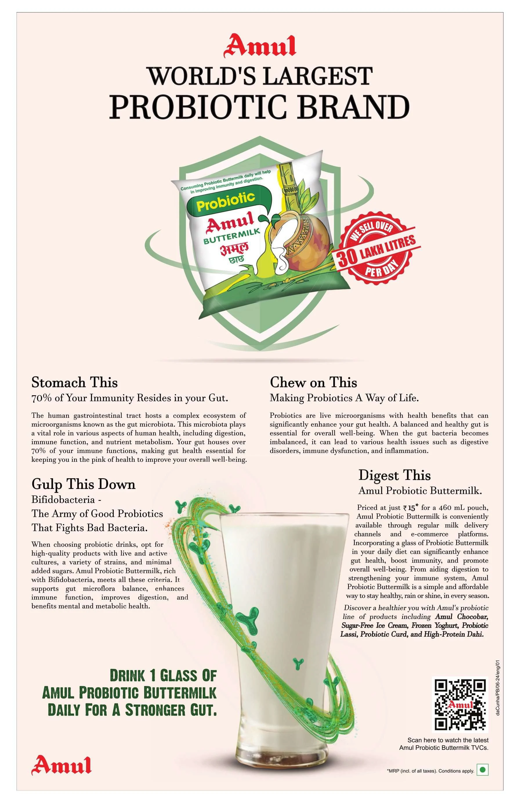
Amul’s ad positions itself as a leader in the probiotic market with a striking headline: “World's Largest Probiotic Brand.” The design uses a clean, spacious layout that immediately draws the eye to the central image of their buttermilk packet. The background is kept simple to avoid distractions, ensuring that the focus remains on the product.
 |
| Image Credit: Amul India |
The text is divided into digestible chunks, each with a playful heading like “Stomach This” and “Gulp This Down.” This approach not only informs but also entertains the reader. The use of green hues signifies health and freshness, reinforcing the product's benefits.
Chew on This: Engaging the Reader
The ad excels in engaging the reader with interactive text elements. “Chew on This” and “Digest This” prompt readers to think about their gut health and the role of probiotics in their diet. This conversational tone makes the ad feel like a friendly advice column rather than a hard sell.
Gulp This Down: The Visual Appeal of Health
The image of a glass of buttermilk surrounded by a swirl of green and blue graphics effectively conveys the idea of active, living probiotics. This dynamic visual element adds energy to the ad, making it more appealing and memorable.
Continental: Brew Your Cool Vibe
Setting the Scene: Refreshment in Every Sip
Continental’s cold coffee ad bursts with a sense of refreshment. The background is a cool blue with water droplets, evoking the sensation of a chilled drink on a hot day. The use of ice cubes and the splash effect around the glass of coffee further enhance this feeling.
 |
| Image Credit: Continental Cold Coffee |
Rich n Delicious: A Promise of Quality
The central image of the coffee jar and glass is crisp and inviting. The ad promises “Rich n Delicious Cold Coffee,” and the visual design supports this claim with high-quality imagery. The red and blue color scheme is bold and eye-catching, standing out against the background.
Interactive Elements: Engaging Modern Consumers
The inclusion of QR codes and logos of online shopping platforms like Amazon and Flipkart shows an understanding of modern consumer habits. It invites readers to engage further by ordering the product online, bridging the gap between print and digital media.
Horlicks: Now Tastier & More Chocolaty
Appealing to Children: A Strategic Choice
Horlicks' ad is designed with children in mind, evident from the playful design and the image of a young boy enjoying his drink. The bright blue background is both attractive and attention-grabbing, creating an energetic feel.
 |
| Image Credit: Horlicks India |
Highlighting Nutritional Benefits
The ad effectively highlights the nutritional benefits of the product, with icons representing calcium, iron, and vitamin B12. This not only reassures parents about the health benefits but also makes the ad informative.
Visual Consistency: Strengthening Brand Identity
The use of Horlicks’ signature colors and fonts ensures brand consistency. The visual elements, such as the splash of chocolate and the dynamic posture of the child, convey a sense of excitement and enjoyment.
Mother Dairy: Presenting Pure Buffalo Milk
Strength and Happiness: An Emotional Appeal
Mother Dairy’s ad for their buffalo milk product combines simplicity with emotional appeal. The background’s soft, pastel colors create a calming effect, while the image of a glass of milk alongside the product packaging highlights purity and quality.
 |
| Image Credit: Mother dairy |
Clear Messaging: Focused and Direct
The message “Strength and happiness in every sip” is prominently displayed, supported by icons that emphasize the product’s benefits—full of protein, extra creamy, and great taste. This clear and direct messaging ensures that the ad’s benefits are immediately understood.
Traditional Yet Modern: A Balancing Act
While the ad maintains a traditional look with its clean design and straightforward presentation, it also incorporates modern elements like the high-quality images and professional layout, appealing to both older and younger demographics.
Wagh Bakri: Rejuvenate Everyday
A Family Affair: Building Trust
Wagh Bakri’s ad focuses on the family aspect of tea drinking. The image of a smiling couple enjoying their tea together fosters a sense of trust and reliability. The warm colors used in the background and the packaging create a welcoming and homely atmosphere.
 |
| Image Credit: Wagh Bakri Tea |
Promoting Variety: Emphasizing Choices
The ad effectively promotes the variety of tea available, with the inclusion of both premium leaf tea and spiced tea. This variety is visually represented through the different packaging designs, encouraging consumers to explore more options.
Strong Branding: Consistent and Recognizable
The use of Wagh Bakri’s logo and consistent color scheme across their ads helps in reinforcing brand identity. The ad’s design ensures that it is immediately recognizable as part of the Wagh Bakri family.
Conclusion: The Art of Newspaper Advertising
In reviewing these advertisements, it’s clear that effective newspaper ads combine strong visual elements with clear, engaging messaging. Each of these ads leverages different design techniques to capture attention and convey their message effectively.
From Amul’s scientific approach to Horlicks' playful design, each brand has crafted their advertisement to resonate with their target audience. The use of vibrant colors, interactive elements, and clear benefits helps these ads stand out in a crowded marketplace.

